You update your Twitter profile, upload a logo that looked fine in your camera roll, and move on. Then you see it in the feed. It’s soft, cramped, and the text inside the logo is unreadable.
That tiny image does more brand work than is commonly realized. For a lot of small businesses, it’s the first thing a customer notices before reading a single post, bio line, or reply. If the profile photo looks messy, the account feels messy.
The fix usually isn’t complicated. Most profile picture problems come from three things: using the wrong dimensions, composing for a square when Twitter shows a circle, and exporting in the wrong format. Once you handle those correctly, the result looks sharper everywhere your account appears.
If you’re building your presence on X and want the rest of your profile to look as polished as the photo, this guide to Twitter and X marketing basics is a useful companion. For now, let’s get your profile picture right the first time.
Why Your Twitter Profile Picture Matters More Than You Think
A strong twitter profile picture size setup does one job fast. It makes your account look credible before anyone evaluates your content.
That matters most for founders, consultants, creators, and local businesses running lean. If you’re posting from a personal brand account, people decide in seconds whether you look established, active, and worth following. A blurry headshot or a logo jammed against the edges works against you immediately.
I’ve seen this happen in simple, familiar ways. A bakery uses a full storefront photo, which looks fine enlarged, but turns into a dark blob in the feed. A consultant uploads a rectangular headshot cropped into a square, and Twitter’s circular display clips the top of the hair and the chin. A SaaS founder uses a logo with tiny lettering, and the name disappears the moment it shrinks.
Practical rule: If someone can’t recognize your face or brand mark at a glance, the image isn’t ready yet.
The good news is that this is one of the lowest-effort improvements you can make to your profile. You don’t need a designer. You need the right dimensions, the right crop, and a workflow that respects how the image appears on the platform.
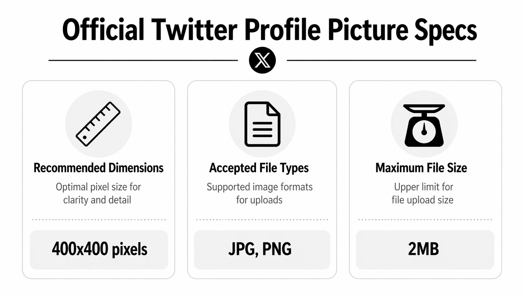
The Official Twitter Profile Picture Specs
Start with a square file that gives Twitter enough clean image data to resize without softening the details. The recommended Twitter profile picture upload size is 400 x 400 pixels, with a 2 MB maximum file size and support for JPEG, PNG, and GIF, according to Tweet Archivist’s Twitter image size guide.
Twitter Profile Picture Quick Reference 2026
| Attribute | Specification |
|---|---|
| Recommended upload size | 400 x 400 pixels |
| Minimum accepted size | 200 x 200 pixels |
| Display size on profile page | 200 x 200 pixels |
| Maximum file size | 2 MB |
| Accepted formats | JPEG, PNG, GIF |
| Shape for most accounts | Circle |
| Shape for Verified Organizations | Square |
The square 1:1 aspect ratio matters for more than compliance. It makes your editing faster, keeps templates reusable, and reduces crop mistakes if you also use the same source image on LinkedIn, Instagram, or Google Business. For a solo business owner working from a phone, that saves time immediately.
If aspect ratios are still fuzzy, this explainer on understanding various photo dimensions and aspect ratios gives a practical explanation of how dimensions and cropping affect the final image.
What these specs mean in practice
A 400 x 400 file is the safe starting point because it is large enough to stay clean after resizing, but still small enough to export quickly from mobile apps without fighting file limits. I usually tell clients to build one master square image at this size first, then test it small before they upload anything.
File type matters too. PNG is usually the better pick for logos, icons, and graphics with sharp edges. JPEG is often better for headshots because it keeps file sizes lower. If your design app lets you export WEBP, it can be useful as a working file during mobile-first editing because it keeps quality high at a smaller size, but Twitter profile uploads officially support JPEG, PNG, and GIF, so convert to one of those before uploading.
One more practical detail. Your uploaded image is square, but most accounts display it as a circle. That means corners are visually disposable space, not a safe place for text, taglines, or fine border elements. Verified Organizations are the exception because their profile photos display as squares, so edge details remain visible.
How Your Picture Displays Across Devices and Feeds
The biggest mistake isn’t uploading the wrong file. It’s judging the image only by how it looks during editing.
Twitter doesn’t show your profile photo in one place or one size. A file that looks balanced in your design app can lose all clarity once it gets scaled down in the timeline, replies, and notifications. That’s why a profile photo needs to work as a thumbnail first and an enlarged image second.
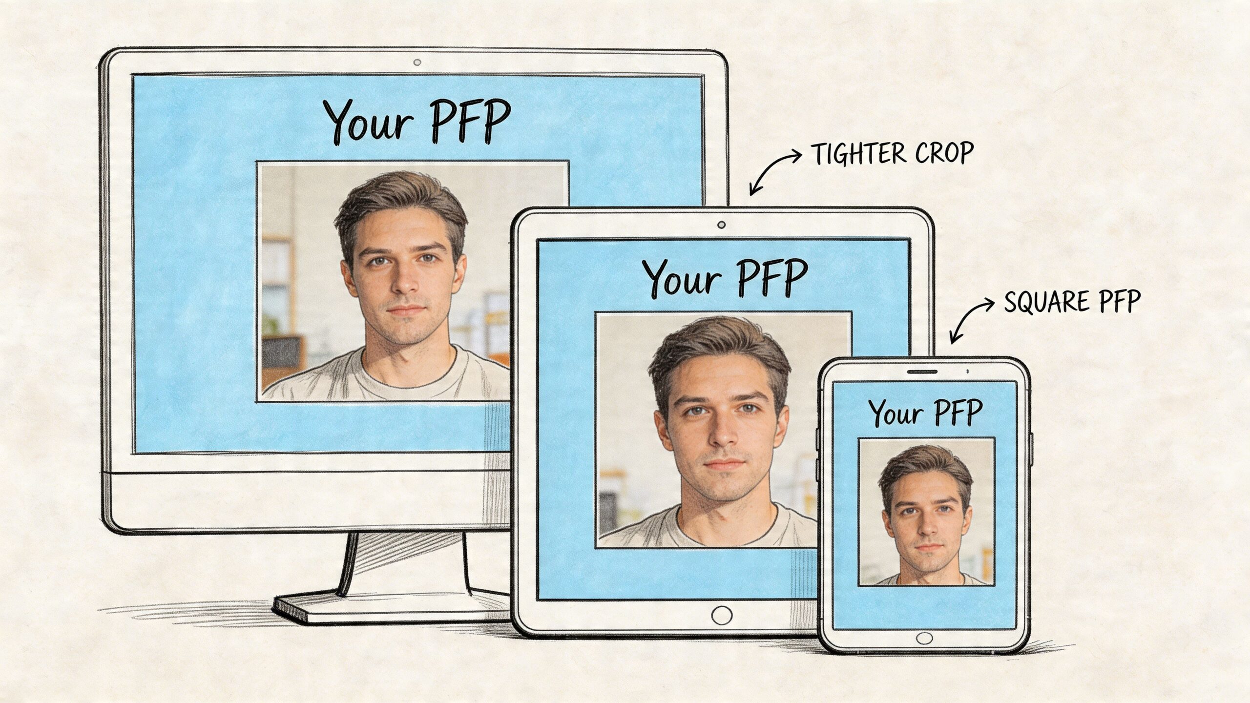
Where the image shrinks
On-platform display changes fast. The image appears at 200 x 200 pixels on your profile, 48 x 48 pixels in tweet feeds, and 32 x 32 pixels in notifications, as noted in the verified specs from Soona’s Twitter spec guide.
That drop is severe. The same source also notes that the move from 400 x 400 upload dimensions to 48 x 48 feed display is more than an 8:1 reduction in size, which is why weak compositions fall apart so quickly in the feed.
What still works after scaling
At small sizes, detail disappears before shape does. That’s why the best Twitter profile pictures usually have:
- One focal subject instead of multiple elements
- Strong contrast between subject and background
- Minimal text or no text at all
- Clean separation around the edges of a logo or face
A practical example: a photographer’s face on a plain background usually survives feed scaling better than a full-body portrait. For a business logo, a simple symbol often holds up better than a full lockup with tagline and tiny lettering.
Your profile photo is a thumbnail in motion. Design it for speed of recognition, not for close inspection.
A quick thumbnail test
Before uploading, zoom out or shrink the file inside your phone’s photo viewer. If the main subject stops being recognizable, adjust the crop before you publish.
That one check catches most avoidable mistakes. It also saves time because you won’t be re-exporting files after seeing the problem live on your account.
Cropping Your Photo to Fit the Perfect Circle
Most Twitter profile image problems are crop problems.
The upload is square, but the visible result for most accounts is circular. If your important details sit near the corners, Twitter will trim their visual impact the moment the image appears on your profile or in the feed.
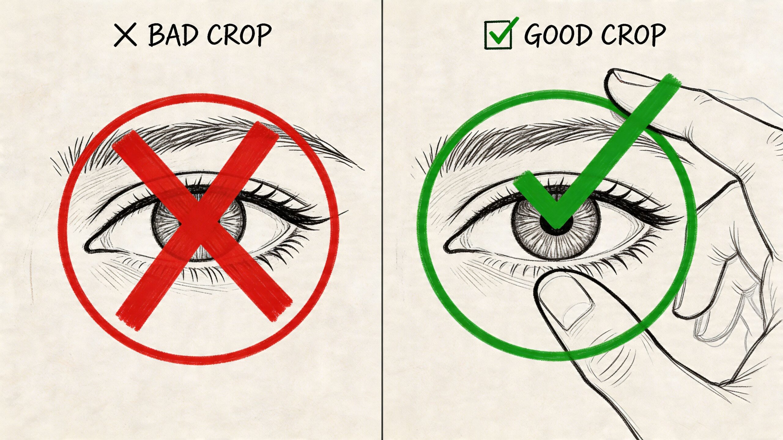
Use a centered safe zone
When I prep a profile image, I treat the middle of the canvas as the only area that matters. Keep the face, logo mark, or core symbol centered with breathing room around it.
Don’t place essential text, corners of a badge, or the edges of a face close to the outside border. Even if the square file looks balanced, the circular display will make it feel cramped.
A safe working approach:
- Center the main subject so it remains intact after the circular crop
- Leave margin around the edges instead of filling the whole square
- Avoid edge-hugging text because it becomes harder to read and easier to clip
- Check the file against a circle overlay in your editing app if available
Headshots that crop well
For personal brands, head-and-shoulders shots usually perform best. Put your eyes slightly above center and keep the face large enough to stay clear at thumbnail size.
Busy backgrounds hurt more than people expect. A simple wall, soft blur, or solid brand color usually gives a cleaner result than a detailed office, bookshelf, or outdoor scene.
Here’s a useful visual walkthrough on composition and cropping:
Logos that don’t get mangled
Logos need a different treatment. Don’t drop in your full website header logo and hope it works. A horizontal logo with a symbol, company name, and tagline is almost always too dense for this use case.
Better options:
- Use the symbol alone if your brand has a recognizable mark.
- Use the wordmark only if it’s short and bold.
- Create a profile-specific version with more padding and fewer details.
Design shortcut: If your logo contains a tagline, remove it for the profile picture version. The platform is too small for secondary messaging.
If you manage both a founder account and a company account, keep the visual language related. A matching background color or similar crop style helps people connect the profiles quickly.
Choosing the Right File Format and Compression
File format changes how sharp your image looks after upload. For most small business owners, file format determines the difference between “good enough” and “clean and professional” results.
When PNG beats JPG
For logos, icons, and graphics with sharp edges, PNG is the safer choice. Verified data from Metricool’s Twitter image size guide notes that using PNG instead of JPG for logos can retain 15 to 20 percent more edge sharpness at small 48 x 48 feed sizes.
That matters because logos fail at the edges first. JPG compression tends to soften clean lines, especially around text and high-contrast borders. If your business uses a mark with hard edges, PNG usually preserves it better.
When JPG still makes sense
Photos are different. A headshot with natural gradients, skin tones, and background blur often exports perfectly well as JPG, especially if your editing app produces a clean file and you stay under the platform limit.
Use JPG when file size matters more than edge precision. Use PNG when brand marks and crisp outlines matter more than file weight.
If you work across platforms, this guide on optimizing image sizes is a good practical read because the same file-handling habits help well beyond Twitter.
Why WEBP is worth considering
For a mobile-first workflow, WEBP is useful because it keeps files lighter without giving up visible quality in many cases. The same verified Metricool data states that WEBP can reduce file sizes by 25 to 35 percent compared to PNG with no discernible quality loss.
That makes it appealing when you’re exporting from a phone, moving assets between apps, or keeping a tidy content library. My rule is simple:
- Logo or graphic with sharp edges. Start with PNG.
- Photographic headshot. JPG is usually fine.
- Need a lighter file for mobile workflow. Try WEBP, then inspect the result closely before upload.
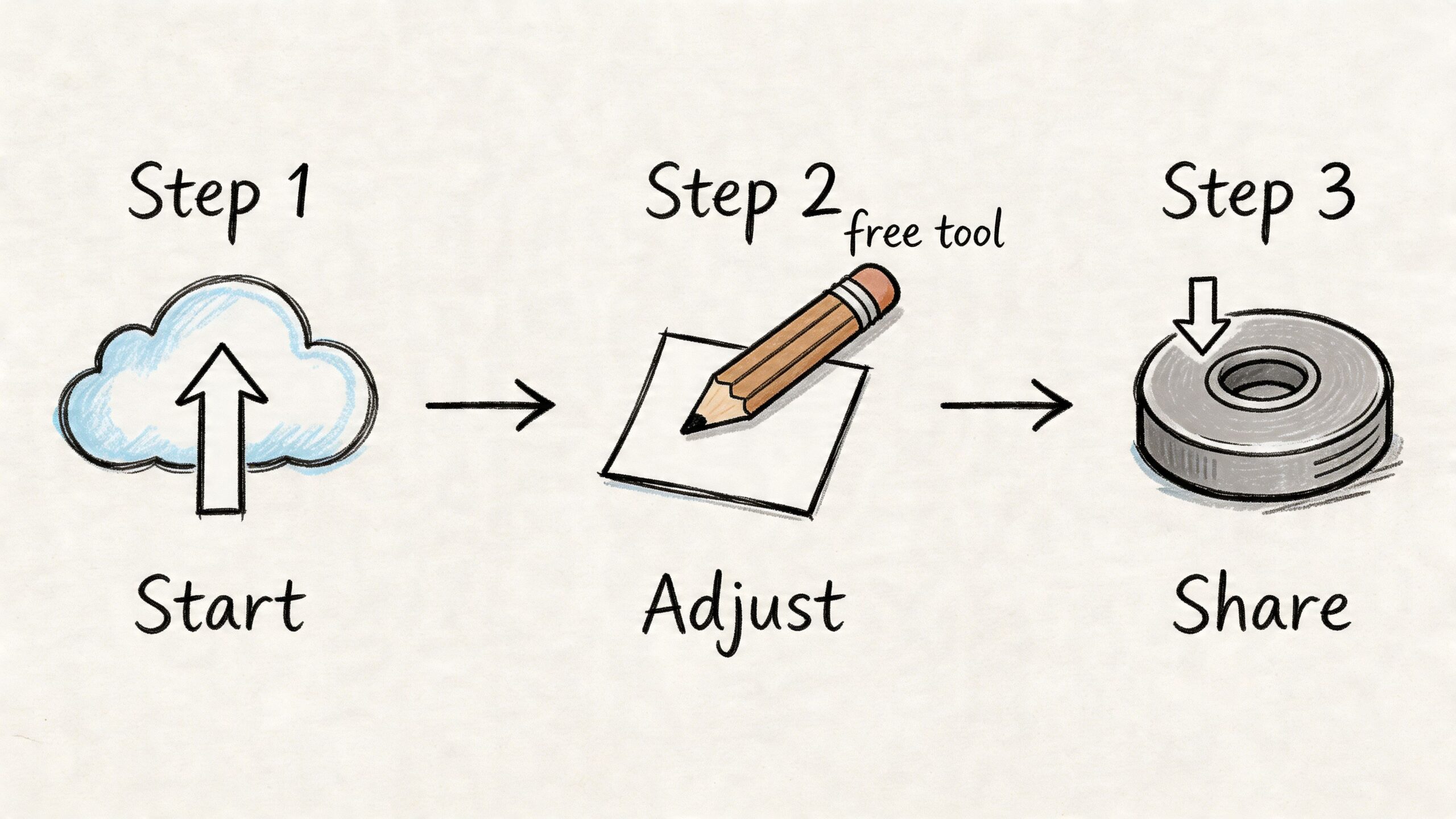
A Simple Workflow Using Free Design Tools
You don’t need Photoshop to get a clean result. A repeatable mobile-friendly workflow matters more than fancy software.
A fast Canva workflow
Canva is the easiest starting point for most solopreneurs. Open a custom design, set the canvas to 400 x 400 pixels, then upload your photo or logo.
From there, keep the process simple:
Pick one asset
Use one headshot, one logo mark, or one wordmark. Don’t combine too many elements.
Center it with padding
Make the main subject prominent, but leave enough room so the circular crop won’t feel tight.
Test at small size
Zoom out inside Canva or export and check it on your phone. If it looks busy there, it’s too busy.
Export the right format
Choose PNG for logos and graphics. Choose JPG for photographs if the export looks clean.
Good tool stack for non-designers
Canva covers most profile-picture tasks well. If you want alternatives, Photopea and Squoosh are also useful for resizing and export cleanup. Pricing for any of these tools is best checked on each product’s website.
If your brand work extends beyond a static profile image, this roundup of best online logo animation maker tools is handy for exploring ways to create animated brand assets for other channels.
A workflow that saves time later
The smartest move is to save more than one final file:
- Primary export for the current Twitter profile
- Editable master file with layers or repositionable elements
- Alternate version with slightly more padding for safety
That small habit keeps you from rebuilding the design later when you want to refresh your branding or reuse the image elsewhere. If you’re also reviewing the rest of your social stack, this list of content creation tools for social media is a useful reference for building a lean toolkit.
Save the editable source before you upload anything. Revisions are much faster when you’re not starting from a flattened file.
How to Upload Your New Twitter Profile Picture
Once the image is ready, the upload itself is straightforward. The only thing that matters here is checking the crop preview before you save.
On desktop
- Sign in to your Twitter or X account in a web browser.
- Open your profile page.
- Click Edit profile.
- Click the profile photo area or camera icon.
- Select your finished image file.
- Adjust the crop if Twitter prompts you.
- Save the change and review how it looks on your live profile.
After it updates, check the account from the main profile view and from the feed. If your image contains a face or logo, also make sure it still reads clearly in smaller contexts.
On mobile
- Open the Twitter or X app on iPhone or Android.
- Go to your profile.
- Tap Edit profile.
- Tap the profile image area.
- Choose a photo from your device or upload a saved design.
- Reposition as needed, then confirm.
- Save and inspect the final result in-app.
If your account represents a business, remember accessibility too. Your profile image itself doesn’t carry the same handling as in-post media, but your broader visual workflow should still account for inclusive publishing. This guide on what alt text is and how to use it well is worth keeping in your process.
Troubleshooting Common Profile Picture Problems
Even when the file meets the specs, a few common issues still show up. Most of them are easy to fix once you know the cause.
My picture looks blurry
This usually happens for one of three reasons. The original image was too soft, the export compression was too aggressive, or the wrong format was used for the asset type.
Fix it by going back to your source file and exporting again from the cleanest version you have. If it’s a logo, export as PNG. If it’s a headshot, use a cleaner source image and avoid stacking filters before export.
The crop looks awkward
That’s usually a composition problem, not an upload problem. The subject is too close to the top, bottom, or edges, so the circular display makes it look cramped.
Reopen the file and add more breathing room around the main subject. For logos, reduce scale slightly. For headshots, shift the face toward the center and remove unnecessary background clutter.
The file won’t upload
The likely cause is format or file-size mismatch. Make sure the image is in a supported format and kept within the accepted size limit for profile pictures.
If your editing app exported something unusual, re-export as PNG or JPG from Canva, Photopea, Preview, or a similar mainstream tool. Keep the file tidy and simple.
The logo text is unreadable
This is common with full brand lockups. The logo may be technically correct but visually too dense for thumbnail display.
Try one of these adjustments:
- Use the icon only instead of the full lockup
- Drop the tagline and keep just the brand name
- Increase contrast between logo and background
- Create a profile-specific brand mark rather than reusing a website asset
Download Free Profile Picture Templates
The fastest way to avoid crop and spacing mistakes is to start with a template built for the job.
A good profile picture template does three things at once. It gives you the correct square canvas, reminds you where the circular crop will bite, and saves you from rebuilding the same layout every time you update your branding. That’s especially useful if you run multiple accounts or tend to make edits from your phone between customer work.
The most useful template setup includes:
- A 400 x 400 pixel canvas
- A visible safe-zone guide so you know where to keep important details
- Separate versions for headshots and logos
- An editable format for Canva or Photoshop
For practical use, keep one master template for personal branding and one for business branding. Your founder photo and your company logo need different spacing rules, so it helps to have both ready to go.
If you make seasonal changes, campaign-specific swaps, or occasional rebrands, templates cut the work down to a few minutes. Replace the image, adjust the scale, export, upload, and move on.
Frequently Asked Questions
Can I use a GIF as my Twitter profile picture
Yes. Twitter accepts JPEG, PNG, and GIF for profile pictures, as noted earlier in the specs section. For speed and consistency, I still recommend PNG for logos and JPEG or WEBP for photos while you’re editing. Export the final upload in the format that keeps the image clean without bloating the file.
Why does my square logo lose its corners
Twitter displays profile pictures inside a circle, even though you upload a square file. If your logo fills the whole canvas, the outer corners get cut off.
The fix is simple. Scale the logo down slightly and keep the mark inside the center safe area. If a brand name or tagline sits near the edge, remove it for the profile version.
Should I use my full logo or just the icon
Use the icon, symbol, or simplified mark in most cases. Small text disappears fast on mobile, and profile pictures spend most of their time at thumbnail size.
A stripped-down version usually reads better and looks more confident.
Is a headshot better than a logo
It depends on what people need to recognize first. For a consultant, freelancer, creator, or founder-led business, a clear headshot usually builds trust faster. For a company or product account, a logo mark is often the better choice.
If the business sells through your personal reputation, use your face. If the business sells as a brand, use the brand mark.
How often should I update my profile picture
Update it when something real changes. A rebrand, a better headshot, a cleaner logo, or a visible shift in how the business presents itself are good reasons.
Random changes hurt recognition. If people have to relearn your profile every few weeks, you create extra friction for no benefit.
Does the profile picture need to match the header
They do not need to match exactly, but they should look like they belong to the same brand. Consistent color, contrast, and overall tone make the account feel more polished.
This matters more than many small business owners expect. A profile photo and header that clash can make the account look patched together, even if the offer is solid.
What’s the best twitter profile picture size to remember
Keep one number in mind: 400 x 400 pixels.
That size is easy to build, easy to crop, and large enough to stay sharp after upload. Center the subject, check the circle crop on mobile, and keep a reusable source file in case you need to swap colors, photos, or seasonal branding later.
If you want to spend less time resizing assets, rewriting posts, and juggling content across channels, Postful is built for that. It helps small business owners and operators turn ideas into publishable content, reuse what’s already working, and keep social moving without turning it into a full-time job.